
How to make images load faster on your website
On most websites, images account for more of the page weight than everything else combined — the HTML, the CSS, the JavaScript, the fonts. Which means image handling is usually the highest-leverage thing you can fix, and it is also the easiest.
Four changes, roughly in order of how much they help.
1. Stop serving images larger than they display
This is the big one, and it is extremely common. A photo comes off a camera at 4000 pixels wide, gets uploaded as-is, and is displayed in a column 800 pixels wide. The browser downloads all four thousand pixels and throws away four-fifths of them.
The visitor paid for that download in time and mobile data. They saw no benefit whatsoever, because their screen could not show the extra detail.
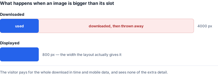
Work out the largest size an image actually displays at, and resize to roughly that. For high-density screens, twice the CSS width is a reasonable ceiling — a 400-pixel slot is well served by an 800-pixel image, and beyond that nobody can tell.
Resizing a 4000-pixel photo to 1200 typically cuts the file by 85 to 90 percent, before you have compressed anything.
2. Use WebP
At the same visual quality, WebP is usually 25 to 35 percent smaller than JPG, and substantially smaller than PNG for graphics. It supports transparency, so it can replace PNG for logos and icons too.
Browser support stopped being a concern years ago — every current version of Chrome, Firefox, Safari and Edge handles it natively. For a website, where you control what gets served, there is very little reason to still be shipping JPG.
AVIF is smaller again, often around half the size of JPG, but encoding is slow and older devices still in daily use may not display it. If you want it, serve it with a WebP fallback rather than alone.
3. Compress sensibly, not maximally
Quality 100 is a waste. On virtually any photograph, the difference between 90 and 100 is invisible while the file is roughly twice the size. The perceptual curve flattens hard around 90, and above 95 you are spending real bandwidth encoding noise nobody can see.
For web images, somewhere around 80 to 85 is usually right — noticeably smaller than 90 with no difference at normal viewing size. Below 70 you begin seeing artefacts around edges and in flat areas of colour.
One thing to avoid: compressing an image that has already been compressed. Each lossy save discards a little more, and the damage compounds. Always start from the best original you have.
4. Reserve the space before the image loads
This one does not make the page faster — it stops it jumping about, which visitors experience as much worse than slow.
If an <img> has no dimensions, the browser does not know how much room to leave, so it renders the text, then the image arrives and shoves everything down the page. If someone was reading, or about to tap a link, they lose their place or click the wrong thing.
Google measures this as Cumulative Layout Shift, and it is one of the Core Web Vitals that feed into ranking. The fix is trivial:
Always set width and height attributes on your image tags. The browser uses them to compute the aspect ratio and reserve the correct space before a single byte of the image arrives. Your CSS can still resize it freely — the attributes are a hint about proportions, not a constraint on layout.
A few smaller wins
Lazy-load images below the fold. Adding loading="lazy"tells the browser not to fetch an image until the visitor scrolls near it. Donot put it on your main hero image — that one should load immediately, since it is usually what determines your Largest Contentful Paint.
Cache aggressively. If your image filenames include a content hash, they can be cached effectively forever, because a changed image gets a new filename. Repeat visitors then download nothing at all.
Do not use an image where CSS or text would do. Gradients, solid shapes, simple icons and anything containing readable text are usually better as CSS or SVG — smaller, sharper at every screen density, and selectable.
Doing this to an existing site
If you have hundreds of images already live, the order that gets results fastest:
Find your heaviest pages, look at which images dominate them, and fix those first. A handful of oversized hero images usually account for most of the problem, and resizing five files can outweigh optimising fifty.
Then batch-convert the rest to WebP at a sensible quality. Keep your originals — always convert copies, so you can regenerate at different settings later without having degraded the source.
How to check whether it worked
Open your browser's developer tools, go to the Network tab, filter to images, and reload. You get a list of every image with its size, sorted however you like. Anything over a few hundred kilobytes on a normal content page deserves a look.
For the ranking-relevant view, PageSpeed Insights reports Core Web Vitals and will name specific images it thinks are oversized. Bear in mind it reports lab data unless your site has enough real traffic for field data, and the two can differ.
The short version
Resize images to the size they actually display at — this is most of the win. Serve WebP. Compress to about 80 to 85, not 100. Put width and height attributes on every image so the page stops jumping. Lazy-load everything below the fold except the hero.
Tools for this
- Resize Image — exact dimensions, batch supported
- JPG to WebP — the single biggest format win
- PNG to WebP — for graphics and logos, transparency kept
- Compress Image — target a file size directly